
How to Create Truly Reusable Components with SwiftUI

The primary goal of any code is to be compact, reusable, and clear. In the mobile industry, developers tend to optimize their workflow by moving modules to packages and adding dependencies for large features like Kingfisher for networking. While creating components, most developers in companies or indie projects create their own libraries with components they will use in the app. In this example, I will tell you how to create a truly reusable and independent element which can be customized for almost ANY project. In my previous article, I explained how to create a component for a specific design system where the design is defined. Here, the design is mostly up to the developer.
Defining Constraints
For simplicity, I will work on a text field component which will have a header, text input, background, padding, and corner radius. All UI will be stored in a configuration structure named SXTextField. First, let's define basic configurations like color and padding

In case you want to create other components, you can simply call these configurations
Here is the configuration struct for the SXTextField:
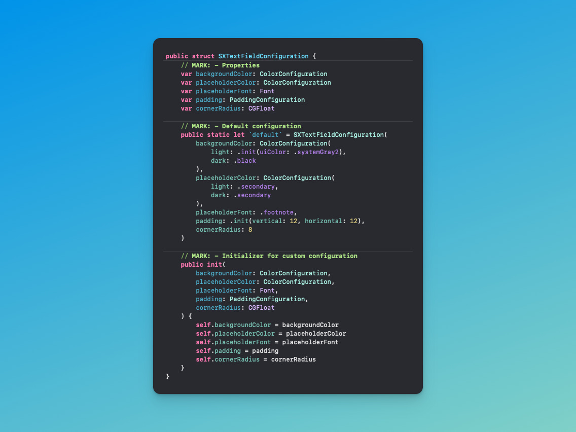
Here you can see all the UI parameters which can be configured for our component and a default style with predefined values. If you want to create your own configuration for the text field using different padding or background, use the public initializer
Creating the Text Field
Now let's combine the UI configuration and logical setup, such as defining the placeholder for the text input and header text

In order to control the current theme, we are using the colorScheme environment value and local variables to switch the background and text color automatically. We won't modify the text field's text color itself in order to follow Apple's Human Interface Guidelines (HIG).
Here's how you'd call this text field:
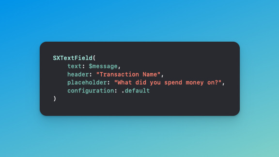
A few lines of code give you a text field with the default UI configuration - pretty easy, right? Instead of creating all this mess in the project file, you can unload it to a package or another file and just call the component in one line!
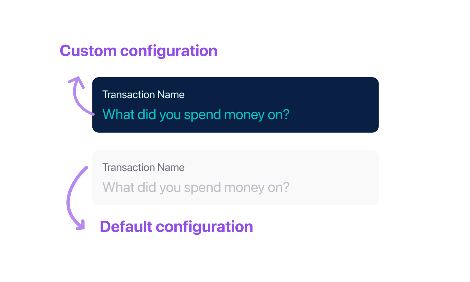
Custom Configuration
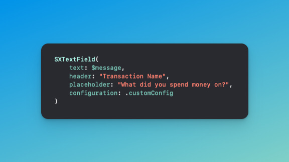
What about a different configuration? If you have another design in mind, we can simply create an extension for our configuration structure with your own values

And then call it simply like this:
Conclusion
The main goal when building a reusable component is to make it independent of its own parameters and give maximum freedom when defining UI constraints. Also, create helper configurations to reduce lines in the initially complex structure. The full code will be available in a GitHub Gist