


How I Created a Personal Component Design System for iOS Apps

Whether you’re building a personal app or working in a company where your team hasn’t moved UI components’ design to a separate library, it’s time to make that leap. In this article, I’ll walk you through my approach to creating reusable components using SwiftUI. I’m skipping the basic library setup in Xcode (plenty of tutorials cover that) and focusing on what really matters: building a robust component system.

Why Design Libraries Are Worth It?
Let me share why I’m such a big advocate for component libraries. First, they significantly reduce the load on your main project — we’re talking faster build times and cleaner codebases. When you need to tweak designs (and trust me, you will), having components isolated in a separate project keeps you from accidentally breaking business logic.
Here are the core principles I followed:
Keep UI logic external — Component states should be controlled by external variables. For instance, a toggle’s state lives outside the component, not buried within it.
Maximize configurability — I made components highly customizable through variables rather than complex internal logic. This approach has saved me countless hours when adapting components for different use cases.
Embrace atomic design — Think LEGO bricks. I build complex components from smaller, independent pieces. This makes maintenance and updates much more manageable.
Getting Started: The Foundation
Before diving into complex components, I needed a solid foundation. Let’s start with color management:
import SwiftUI
import UIKit

public extension Color {
  static var primaryGreen : Color { Color(uiColor: UIColor(red: 0.169, green: 0.38, blue: 0.451, alpha: 1.00)) } // #2b6173
  static var darkGrey : Color { Color(uiColor: UIColor(red: 0.36, green: 0.38, blue: 0.4, alpha: 1)) } // #5D6166
  static var border : Color { Color(uiColor: UIColor(red: 0.871, green: 0.878, blue: 0.89, alpha: 1)) } // #dee0e3
  static var secondaryYellow : Color { Color(uiColor: UIColor(red: 0.91, green: 0.96, blue: 0.41, alpha: 1.00)) } // #E8F569
  static var backgroundGrey : Color { Color(uiColor: UIColor(red: 0.98, green: 0.98, blue: 0.98, alpha: 1)) } // #fafafa
  static var alertRedOpacity: Color { Color(red: 0.996, green: 0.945, blue: 0.945) } // #FEF2F1
  static var alertRed: Color { Color(red: 0.792, green: 0.11, blue: 0.2) } // #CA1C33
  static var alertDarkRed: Color { Color(red: 0.345, green: 0, blue: 0.008) } // #580002
  static var alertGreenOpacity: Color { Color(red: 0.882, green: 0.992, blue: 0.957) } // #e1fdf4
  static var alertDarkGreen: Color { Color(red: 0, green: 0.314, blue: 0.145) } // #005025
  static var alertGreen: Color { Color(red: 0.016, green: 0.69, blue: 0.435) } // #04b06f
}
For faster colors generation I used this HEX converter
For my base layer, I created an EXBase component. It’s my go-to foundation when I need consistent background and padding across different elements:
public struct EXBase<Content: View>: View {
  let content: () -> Content
  public init(@ViewBuilder content: @escaping () -> Content) {
    self.content = content
  }
  public var body: some View {
    content()
      .padding(12)
      .background(Color.backgroundGrey)
      .cornerRadius(8)
  }
}
Breaking Down a Real Example: EXInfoCard
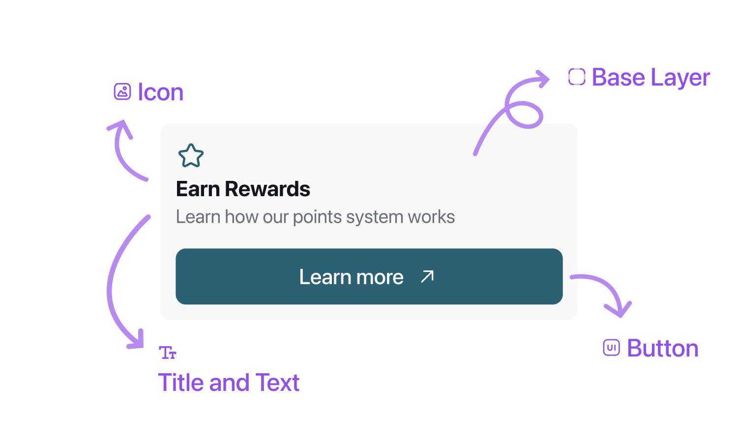
Let’s look at something practical — the EXInfoCard component. You’ve probably seen this pattern countless times in mobile apps: an info card with an icon, title, text, and sometimes a button. The goal here was maximum flexibility with complete independence from business logic.
Here’s how I structured it:
public struct EXInfoCard: View {
    var title: String
    var text: String
    var icon: IconType?
    var isButton: Bool
    var buttonIcon: Image?
    var buttonText: String? = nil
    var buttonAction: (() -> Void)?

    public init(
        title: String,
        text: String,
        icon: IconType? = nil,
        isButton: Bool = false,
        buttonIcon: Image? = nil,
        buttonText: String? = nil,
        buttonAction: (() -> Void)? = nil
    ) {
        self.title = title
        self.text = text
        self.icon = icon
        self.isButton = isButton
        self.buttonIcon = buttonIcon
        self.buttonText = buttonText
        self.buttonAction = buttonAction
    }

    public var body: some View {
        EXBase {
            VStack {
                VStack(alignment: .leading, spacing: 5) {
                    if let icon = icon {
                        switch icon {
                        case .imageName(let imageName) where !imageName.isEmpty:
                            Text(imageName)
                        case .image(let image):
                            image
                                .foregroundColor(.primaryGreen)
                        default:
                            EmptyView()
                        }
                    }
                    Text(title)
                        .font(.system(.headline, weight: .semibold))
                    Text(text)
                        .font(.system(.subheadline, weight: .regular))
                        .foregroundColor(.darkGrey)
                }
                .frame(maxWidth: .infinity, alignment: .leading)

                if isButton, let buttonIcon = buttonIcon, let buttonText = buttonText, let buttonAction = buttonAction {
                    Button(action: {
                        buttonAction()
                    }) {
                        HStack {
                            Text(buttonText)
                                .font(.system(.subheadline, weight: .semibold))
                            buttonIcon
                        }
                        .frame(maxWidth: .infinity)
                    }
                    .buttonStyle(EXPrimaryButtonStyle(showLoader: .constant(false)))
                    .padding(.top, 5)
                }
            }
        }
    }
}
Notice how the component doesn’t make any assumptions about when to show or hide elements? Instead, it responds to external state variables. For example, the button’s visibility is controlled by an isButton parameter, which you can tie to any @State variable in your views:
@State private var condition: Bool = false

EXInfoCard(
   title: "Earn Rewards",
   text: "Learn how our points system works",
   icon: .imageName("⭐"),
   isButton: condition,
   buttonIcon: Image(systemName: "arrow.right"),
   buttonText: "Learn More",
   buttonAction: {}
)

// Condition logic definition
Key Takeaways
Building this library taught me valuable lessons about creating truly reusable UI components:
Think in systems, not screens — Every component should work anywhere, not just for your current use case
Make configurations public — Using public enums and structures means better reusability across projects
Keep customization options broad but meaningful — Strike a balance between flexibility and complexity
I’ve made this library open source, so feel free to use it in your next project or as a template for your own system. You can find it on GitHub and check out more details on library’s website.
Remember, a good component library evolves with your needs. Start small, focus on reusability, and keep refining as you go. Trust me, your future self will thank you for taking the time to build this foundation.
... why not just create a viewmodifier? then you can make a view extension, so all you have to call is .exBaseStyle(), instead of adding another layer of curlys.